
Esta vez les traigo un pequeño tutorial para los que utilizamos galería de imágenes y así esta sea más vistosa, el proyecto lo puedes ver aquí:
https://proyectos.teclatinos.com/3D-Rotating-Image-Gallery-CSS/
y para lo cual les copio el código a continuación.
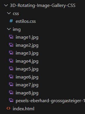
Esta será la estructura de nuestros ficheros.
Nuestro index.html quedaría así.
<!DOCTYPE html>
<html>
<head>
    <meta charset="UTF-8">
    <meta name="viewport" content="width=device-width, initial-scale=1.0">
    <title>CSS 3D Rotating Image Gallery</title>
    <link rel="stylesheet" href="css/estilos.css">
</head>
<body>
    <div class="box">
        <span style="--i:1;"><img src="img/image1.jpg" alt="" width="300"></span>
        <span style="--i:2;"><img src="img/image2.jpg" alt="" width="300"></span>
        <span style="--i:3;"><img src="img/image3.jpg" alt="" width="300"></span>
        <span style="--i:4;"><img src="img/image4.jpg" alt="" width="300"></span>
        <span style="--i:5;"><img src="img/image5.jpg" alt="" width="300"></span>
        <span style="--i:6;"><img src="img/image6.jpg" alt="" width="300"></span>
        <span style="--i:7;"><img src="img/image7.jpg" alt="" width="300"></span>
        <span style="--i:8;"><img src="img/image8.jpg" alt="" width="300"></span>
    </div>
</body>
</html>
Posteriormente nuestro archivo estilos.css quedaría así.
* {
    margin: 0;
    padding: 0;
    box-sizing: border-box;
}
body {
    display: flex;
    justify-content: center;
    align-items: center;
    min-height: 100vh;
    background: url(../img/pexels-eberhard-grossgasteiger-1421903.jpg);
    background-size: cover;
}
.box {
    position: relative;
    width: 200px;
    height: 200px;
    transform-style: preserve-3d;
    animation: animate 20s linear infinite;
}
@keyframes animate {
    0% {
        transform: perspective(1000px) rotateY(0deg);
    }
    100% {
        transform: perspective(1000px) rotateY(360deg);
    }
}
.box span {
    position: absolute;
    top: 0;
    left: 0;
    width: 80%;
    height: 80%;
    transform-origin: center;
    transform-style: preserve-3d;
    transform: rotateY(calc(var(--i)* 45deg)) translateZ(300px);
    -webkit-box-reflect: below 0px linear-gradient(transparent,transparent, #0004);
}
.box span img {
    position: absolute;
    top: 0;
    left: 0;
    width: 100%;
    height: 100%;
    object-fit: cover;
}
Y así es como se ve funcionando.
Espero les guste comparte.